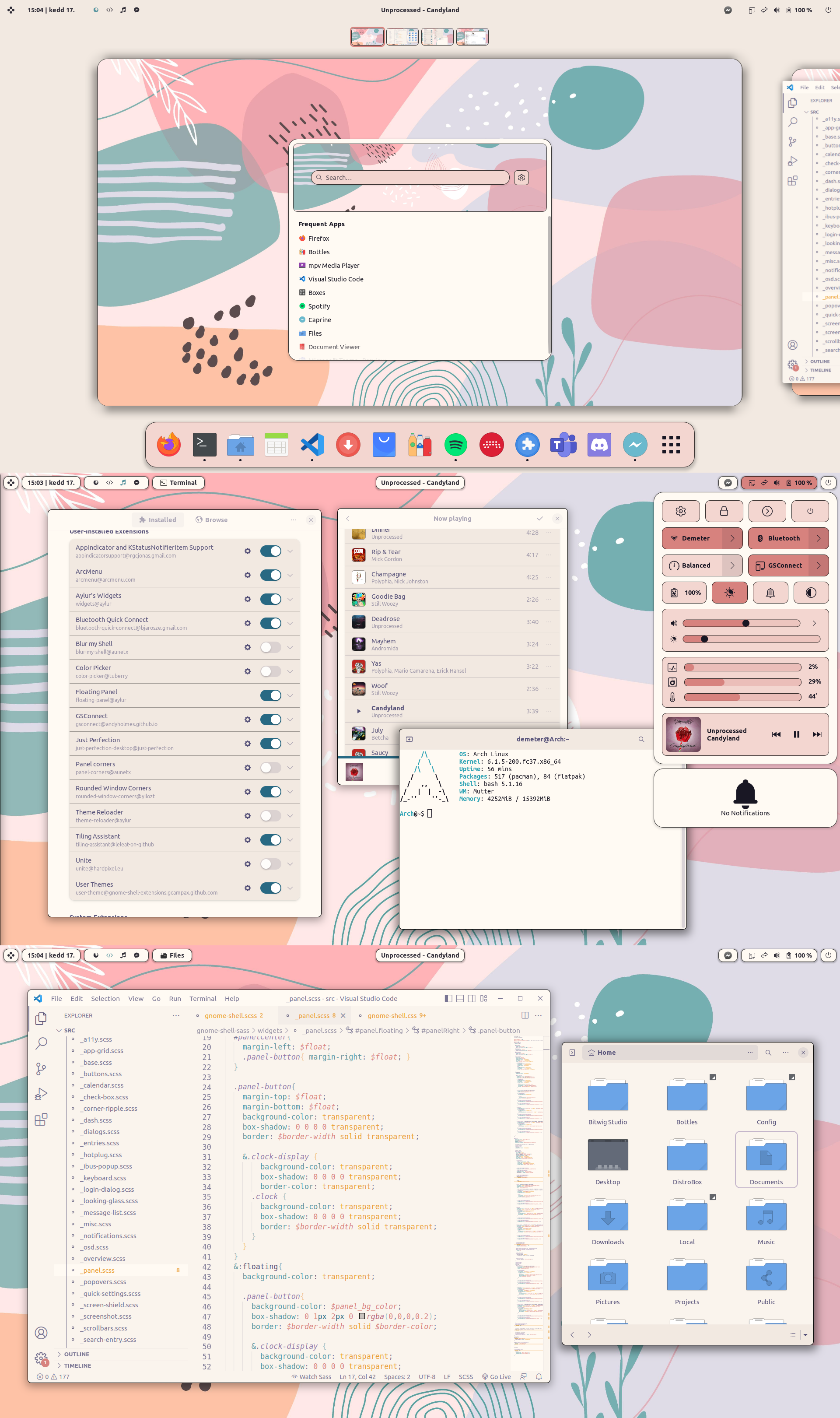
While writing Image viewer/media player for minimalist about the five stages of rice image viewer, I realized that those five stages are not just about rice image viewer, it's about minimalism rice as a whole. So I wrote this blog post to dive into the five stages of minimalist rice.
1. Normie
These newbies have just installed Linux, specifically Ubuntu or Ubuntu-based with a popular DE like Gnome or KDE. They installed some extensions, themes, icons and felt quite satisfied with their setup, thinking that they would never thinker with the OS ever again.
2. Beginner
After installing Linux and everything, that newbie must also watch a lot of Linux videos on Youtube, so his feed shows quite a lot of Linux Youtubers, he clicked on it and suddenly heard the three words "I use Arch" (four if you count "BTW"). They back up everything and distro-hop to Arch or an Arch-based distro. It wasn't long before they also discovered r/unixporn, their eyes light up, they quickly install BSPWM + Polybar or Hyprland + Waybar and spend 2-3 weeks to rice it.
Using tiling WM is dedicated to following the keyboard workflow, but the keyboard workflow on Linux can't be perfect without the terminal.
GUI != Cool
TTY == Hackerman
They started learning how to use the shell, replacing most GUI apps with TUI/CLI apps and replacing the main shell with anything but Bash. They rice their prompt with Starship, installs Exa and other Rust-replacements CLI tool. Wouldn't be surprised if they've spent months learning and configuring NeoVim at this point.
3. Minimalist
Tiling WM is bloat
I used to use an advanced tiling WM but after I read this post. When I first reading the post, I hate it, I think it is stupid, he just using the wrong way... But then I realize that my workflow rarely need tiling windows in a complex way to begin with:
- When I'm using GUI app with mouse, I always maximize the apps.
- When using the terminal or text editor, I just want to look at the focus window and see no value of looking at 3-4 terminal at the same time.
- Tiling 3-4 windows on the screen make everything cramped, the only advantage of this is to easily interact things between windows with a mouse which contradict with the keyboard workflow.
Time to move to floating WM. The thing is that minimalist WMs like SOWM and Berry are pretty janky (at least at the time of writing this) so go back to tiling WM we do, we just need to set the rule to make windows automatically float.
Bar is also bloat
*Sniff sniff* I smell bloat, and that smell comes from the bar. Switch to a lighter bar like Lemonbar or even turn the terminal into bar is unlikely to get rid of the stinky bloat smell.
The problem is that it takes up precious space on my screen, a 16 to 24 pixel-wide space that stretches from one end to the other of the screen is wasted to display: the clock, workspaces, and some crappy information that I really don't need to check constantly. Unacceptable, throw the bar away!
You can show the list of workspaces and the clock only when switching workspaces or using keyboard shortcuts to display it through a notification.
Or go the hardcore route and ditch it altogether, check the time on your watch, wall clock, or use the
datecommand XD. Workspaces are really not necessary when I always maximize windows and rarely tile them anyway. Just use a workspace-less desktop, no need to config, no need to display.
4. Extreme Minimalist
WM... is Bloat. We can also get rid of WM and login manager altogether. Use full TTY from Linux Kernel and type the command to open GUI app... NOWM or [wms] will make the experience less miserable without WM.
Remember those TUI/CLI apps we installed at the beginner stage? We realize we don't need 80% of it, we would rather use the tools available in the POSIX standard to make the script more portable. Then we even removed the file manager!
The shell prompt is now just "$", pwd is the only torch that lights us the way in the file system.
The rice is no longer minimalist, it has become a black hole. Few are brave enough to go beyond, but some legends continue, The few features that identifies them is that they do Linux From Scratch and know what Linux framebuffer is.
5. Maximalist
After a tiresome period of extreme minimalist rice, they have a different view of minimalism. They realize that using DE is very minimal in terms of time and effort. To be honest, DE is not that bloat, It has some features that although we don't always use, but having it is still very convenient in some situation. "And if I don't install or configure anything but just use the default stuff from the DE, the dotfiles will be a lot more minimal!"
And so they decided to go back to installing DE. But this time, with more experience and skill, their rice is better than ever. They even installed more fancy features, more personality, going against the previous minimalism... Finally they felt quite satisfied with their setup, thinking that they would never thinker with the OS ever again...
Credit to Kazoku for the Rice images!


